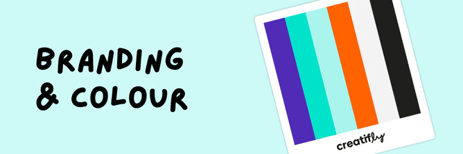
In the world of branding colour is incredibly powerful and often underestimated. The colours you choose to represent your brand can make or break your image. This is where the concept of a colour palette comes into play. So, whether you're diving into the branding world for the first time or thinking about giving your brand a facelift, understanding the magic of colour palettes is a must.
The Power of First Impressions
We all know how important first impressions are, right? Well, your brand's colour palette is often the very first thing people notice. A well-thought-out colour scheme can instantly convey what your brand is all about – its mood, personality, and values. It creates a connection, making it easier for people to relate to your business. Think about the fiery red of Coca-Cola or the calming blue of Facebook. These colours have practically become the brands themselves!
Consistency and Recognition
Consistency is a game-changer in branding, and a colour palette is your secret weapon. By using the same set of colours across all your brand materials – from your logo to your website, marketing stuff, and products – you create a seamless and super recognisable brand identity. This uniformity makes your brand memorable, and that's what we all aim for, right?
At Creatifly, for instance, we've harnessed the power of navy blue and bright turquoise as our signature colours. And let me tell you, this combination is a showstopper! It's like the best of both worlds – professional and creative. People often comment on how this colour combo perfectly encapsulates our brand's vibe. Navy blue brings in that sense of reliability and trust, while bright turquoise adds a dash of creativity and vibrancy.
These colours become the face of your brand, just like our navy blue and bright turquoise represent Creatifly. This distinctiveness makes your brand memorable and keeps people coming back for more. So, when you're building your brand, don't forget the magic that the right colours can bring to the table.
Building Trust and Credibility
Now, the colours you pick can seriously influence how trustworthy and credible your brand appears. Darker, more serious colours like deep blues or blacks can make people think your brand is all about professionalism and reliability. Perfect for financial or tech brands, right? On the other hand, lighter and vibrant colours can give off vibes of fun and creativity, which can be a hit for companies in the fashion or entertainment world.
Differentiating Your Brand
In a crowded marketplace, setting your brand apart is the name of the game. A unique colour palette can be your golden ticket. It helps you stand out and become unforgettable in the minds of your customers. And when you're unforgettable, people are more likely to choose your brand and stick around.
Flexibility and Versatility
A smartly crafted colour palette gives you the flexibility to play around. You can use different colours within the palette for different purposes. Have a primary colour for your logo and major branding stuff, and then sprinkle in secondary and accent colours to add some spice to your marketing materials and designs.
Creating Brand Equity
Over time, a consistent and effective colour palette builds brand equity. This means that your brand's quality and value become associated with the colours you use. Think of the lush green of Starbucks or the iconic pink of Barbie – these colours represent not just products but a whole brand experience.
To wrap it up, your brand's colour palette is like a magic wand for shaping perception, fostering recognition, and forging emotional connections. It's not just about picking your favourite colours; it's about carefully choosing the colours that best mirror your brand's personality and values. So, whether you're launching a brand-spanking-new business or giving your current one a makeover, remember that the colours you pick can have a massive impact on your success.
Choose wisely but remember consistency is key!


